Monday 29 October 2012

PCL - logo concept and justification

From the crit the it was apparent that not many people, if not nobody, understood the reasons behind the features of the logo. When I designed the logo from scratch I didn't have much of a concept in mind and so lot of it so just decorative. However, there is reason in all of it.


THE NAME.

Obediah is a boys name which employs the fact that we are dominantly aiming the brand at men and looking into mens urban fashion. The word is a variant of Obedieh which means 'servant of God', we are not a religious label nor are we religiously biased in anyway. Instead we are using this meaning in the sense that we want to provide an excellent service to our customers and treat them in a way that makes them feel important.

The Trend Original comes from the desire to create a brand that provides a range of clothes that give our customers the sense of uniqueness, individuality and originality. We research into current trends and aim to push them further and develop them and keep the style fresh.

THE COMPASS.

The compass shape is formed by the upper case abbreviation of the company name (OTTO). The implications of the compass aim to evoke the idea that we want to expand and reach customers across the country and beyond.

THE CROSS.

The cross represents the way we target our customers on an almost personal level. We connect with a young audience via social media and networks to keep them up to date and bring them closer to the brand and strengthen their faith in the trends and products we provide.

THE CIRCLE.

The circle is a reflection of the O in Obediah and Original in the brand name and gives a sense of a well rounded brand that provides a full service to it's customers.

Sunday 28 October 2012

PCL - logo development

In response to the first concept crit I've gone back to the logo and addressed a few issues with the design. We didn't want to change too much as we think it works really well as a symbol and people outside of the peer group think it looks great which is a very important part of design prints for clothes as the people need to like the look in order to want to pay for it.

Firstly I addressed the hierarchy in the type and the name way the name is read within the logo. I made the Obediah bigger and tried making it bold so that it stands out more than the rest of the name. Some people read it obediah the trend original, others read it as the obediah trend original and a few others read it as obediah trend original the. It's clear that as this will be our logo, I need to get this communication nailed.


Next I played with the lines that make the cross as people thought they were over done, which can't be denied. However, they are effective and create a really great aesthetic that people are drawn to.


I curved the text to the same curve as the circle to solve the previous problem of the THE and TREND differing in spacing so much either side of the cross symbol.


Lastly I tried the variations without the circle to see it allowed the Hierarchy to be more obvious.


Saturday 27 October 2012

BIKOLOGY - incorporating image in the type

I've not had much time to spend on this brief so the development is going really slowly. I'm quite concerned that I wont be able to get it done to the standard that I want. However I did manage to sketch out some ideas and experiment a bit with imagery and type for the logo.

This is the original type that I chose to be my logo but as the last crit pointed out that I need to develop it further I decided to incorporate the bike icon using the O's as wheels and the L as the bike seat and pedal. I think it's a good initial idea but it could be pushed much further in composition.


Friday 26 October 2012

VIEW - print finishes/foiling

I've been looking into print finishes to give the range a really defined and impactive aesthetic. One which really feels appropriate and is quite interesting is foil blocking using holographic foils. I've done some tests of the type I've designed so far for the crits ahead to show that I'm considering more than just the design at this point.

Photographing the foil is not easy.


I would use the heat press but the laminator was much quicker for me to experiment with. However, some of the foil didn't transfer properly on the type with more ink. Its strange because the first experiments worked nearly perfectly.


The results can be really wonderful if it's done properly and the spectral tint the foil gives off is much like that of the holograms VHL produce.


These are the first tests I did and stick into my sketchbook.


PCL - Screen printing - first batch/test prints

These are the first batch of prints for the t-shirts and swing tags. Marty and I wanted to get the logo on some shirts first to really get the brand out their. We aimed to get 10 done as we didn't want to use up all of our shirts on one design.


This it the positive for the design.


Two of the shirts messed up because I was too careless with the ink and they now have dirty ink marks in odd places and one shirt came out a bit grainy but the rest were fine. We only ended up printing 7 shirts by the end of the day however we got a good 50 or so swing tags and they were cheap to produce.


Not all the tags came out good but for a first attempt they seem alright and the white on black ties in well with the branding.


VIEW - Type concept development

This is the bespoke type I've designed for the publication. It'll be used on the cover and for a few significant headings within the book if it works well and remains appropriate.

The Concept.

Firstly the aesthetic I was going for was a 2D typeface that has an element of 3D within it to mimic the way a hologram appears to have an object inside or coming out of the glass. I've tackled this by creating a skeletal structure to the type that brings the characters out from within the faces.


Secondly, I wanted to apply a subconcept for the way the type is formed based on the RGB lasers that are used to create the holograms at VHL. The boxes below represent the 3 fills use to finish the type. Each fill is a representation of a different laser; black-red, striped-green, white-blue. The density of each fill is relevant to the density of the wave length that creates each coloured laser in the spectrum.


This is what the type looks like so far with the fills applied. Distributing the fills evenly isn't very easy because certain parts of the letters must remain the same across the typeface in order for them to sit properly as a typeface. If it was inconsistent then it would look scruffy and ill considered.


So far I think my concept works really well, just need some feedback on the design before I begin to test print.

Thursday 25 October 2012

CONCEPT CRIT 1

I felt slightly under prepared for this crit but I managed to print out boards for what I've done for each brief. Most people had just presented the design work they had done for 1 or 2 and some 3 briefs so I felt like I was on a similar level with the progress.


I got some good and some bad feedback. The good feedback was really helpful because it was people giving me ideas for the briefs that are in there early development stages. The bad feedback basically just pointed out a lot of errors in my ways of designing for my main brief. So both kinds were good but I came away feeling a bit disheartened by it.


I like getting feedback on my boards its very direct and critical. It makes it much easier to understand which bits people are talking about on the formal feedback sheets.

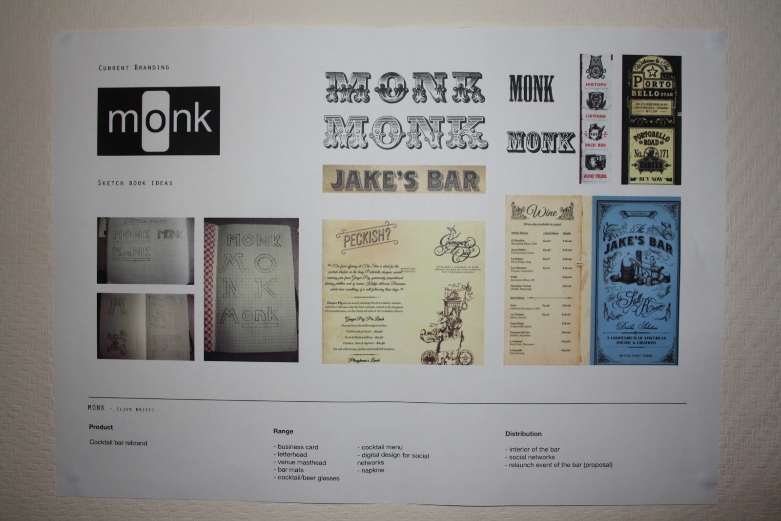
For the MONK, VIEW and BIKOLOGY briefs I didn't have much to show in terms of design development but I have considered all of them and started getting ideas down. This meant that the feedback I got was mostly directed at the PCL brief which I think is a good thing as its the bulk of the work I have to show.


This is the feed back I got from the formal feedback sheets.

Comment on the extent to which the initial briefs have been considered with regards to conceptual development and scope for appropriate products ranges and methods of distribution.


- all briefs have been considered but ideas for method of distribution needed
- MONK - you need to consider what the client wants - illustrative type can still be clean cut 
- consider the high end client base 
- consider colour schemes and stocks
- develop more contextual research as inspiration
- try research into future trends, if its focused on trend you need to be ahead of the curve ask your buddy shaun for some research pointers 
- thorough consideration have you thought enough about new skills (and others) to develop?


Comment on the extent to which the work presented demonstrates appropriate amounts of initial research from appropriate sources.


- an extensive range of research which is informing your design decisions
- BIKOLOGY brief - consider re-writing to work as a branding brief for Bikology shop and design publication work about bicycle anatomy in context of their promotional collateral. Currently seems a little confused/backwards
- there is no clear concept to the elements of the logo, need to either have real justification or get rid of the extra bits
- logo and type hierarchy needs to be addressed
- need broader research for brief 3 and the 4th look like they are still in initial stages
- BIKOLOGY - research into the format and content of publication


Comment on the practical investigation of design ideas, materials and skills have informed decisions relating to possible design solutions.


- obediah - already evidence of practical investigation
- monk - more work needed 

(whoever was giving this feedback wasn't very helpful, they were just stating obvious things about whats in front of them and not giving any suggestions or comments that would help me move forward and improve the work)

- holographics - strong identity needed
- originality - risk of being boring if not done well - more visual development needed
- does the logo need to be so big? I think a more subtle approach is needed
- MONK move away from the decorative type - looks like scruffy American bar where you drink whiskey and dark rum. look at sans serif - minimal type
- MONK - have shop front mock up, think of what you need to propose not just the small print collateral
- OBEDIAH - think bigger - how can you make more plausible - don't just hunk about print designs - shop front, website not just social networks


Additional comments.


- view holographics - keep in mind, content could get complex - keep simple, structured, organised
- type in the logo needs to form a more hierarchical position - doesn't have a place
- consistency in typefaces - use the same in logo as when written out
- purpose of biology publication? - to promote or to stand alone?
- how are these briefs developing your skills?
- think about more digital media (website), maybe typeface design for MONK - more diversity needed


Clearly I've not been focussed enough, I've not been hitting the nails on the head properly and the nails are bent or askew. I'm going to have to readdress a lot of my ideas and really get concrete concepts down for everything I'm doing and produce more work focussing on developing specific skills and a broader range.

Wednesday 24 October 2012

PCL - Logo range

This is the final range of logos that we have settled on. The reason for having so many is so it can be applied to different contexts such as labels, t-shirt designs and screen based social network accounts. It'll be useful to have these variations of the main logo to quickly apply it to these different contexts.

BIKOLOGY - Looking at typefaces

I've gone with a gut instinct for the type face for the publications logo. I like the serif style that the Bikology shop already uses but I don't like the rough and untidy look to it. I want to create a crisp and structured look to the work to represent the solid construction of bikes.

I've looked a lot of serif fonts and begun to narrow them down to one which I think is most effective.


Italicised and slanted fonts don't have as great and impact so I'm going to stick with a firm standing standard font. These are four fonts that I prefer so far.


I've experimented with several in different looks and tried combining some together to experiment with the possibility of fusing two together.


Narrowed down to two fonts.


I like both fonts and I think either would work well but I'm going to settle of Courier because it's bold and it has a more prominent serif that looks similar to the shops logo. The font also looks like a typewriter font that could be used for a journal and I want the publication to feel like a journal. Without being a too cheesy, a bicycle diary.


Monday 22 October 2012

MONK - Logo development - vectored & hand rendered

Here's the development of the logo so far. It still needs some more development doing and once it's nailed I can apply it to the range of corporate deliverables which will cover the first half of the brief. After that I can work on the more innovative design work for the bar itself.