I've had a conversation about the images with Thierry and he's managed to edit and finalise all the photos we needed. We've asked him to put forward the photos that he would like to use and the ones that he thinks are the best because as he has a specific skills set we wanted to hear his opinion and hopefully it would inform ours.
I know have a greater understanding of what a client would usually ask for from a photographer in a more professional environment. Typically they state what they need photographing and how many images they need for example: 6 designs on 3 different coloured t-shirts, 2 images of each. Then the photographer would take about 6 photos of each requested item and the client can pick the best/favourite from those for each item. This makes a lot more sense than the way I was originally selecting the images as I was choosing ones that looked good but a lot of them were very similar and we wouldn't have needed that many variations.
Friday 30 November 2012
Thursday 29 November 2012
MONK - Matchstick holder freebies
I picked up some mini match stick holders from Oporto on Call Lane which they get made with their logo and address on which I though could a be a quick and simple deliverable to add to the project. It's quite an appropriate little 'pick me up i'm yours' freebie as many customers will be likely to smoke during their visit to the bar and even though the have to go outside to smoke by law, they can still take a little bit of the branding with them. Also, others may need a light for their cigarette and they may ask for a lighter. When someone offers them one of these instead they are effectively passing on a bit of the brand.


I've already measured up the net for this little package and it'll be easy to print and assemble.

MONK - Printing matchstick boxes
Finally got back into this brief after leaving it untouched for a week or two. I really need to start producing more work for this as it's a live brief and I don't want the client to feel neglected or that I'm a slow worker.
I've got the designs ready to go for the mini matchstick box so I just went for it a did some test prints.


I've got the designs ready to go for the mini matchstick box so I just went for it a did some test prints.


The first set I printed looked fine until I actually folder them. They logo was upside down on the package so I had to amend them and reprint. I'm quite pleased with the result and the overall idea.

PCL - Image selection
Thierry has sent me some PDF's of all the images that he took at the photo shoot and has asked me to pick out the ones Marty and I would like to be edited and used.
Picking them from contact sheets isn't easy as you can't always see the full quality of the image, but having them on screen and in a print format did make it easier. Originally I chose about 50 images but I knew that this would be way too many and we wouldn't need all of them so I went over the favourited ones and picked out the best of those, trying not to get to many similar ones and to also get as many of the different designs and colours in the final choices.
Unfortunately Marty had to go to work so I made the choice of all the images myself and emailed them over to Thierry. Furthermore, Thierry has asked that we don't use/ blog/ post any of the contact sheets or unedited photos without his permission as they are directly linked to him and he wouldn't want anything to be online that he's not happy with. We're very respectful of this and so we wont be blogging any of the photos or the content of the look book until it's completely refined and finished and we have full approval from Thierry.

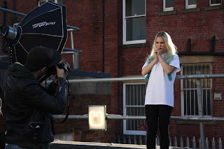
PCL - The photo shoot
Today we finally got to carry out the photo shoot. Two out of the 3 models turned up but we went ahead with it as it wasn't much of an issue. The location was brilliant and when e first got there we explored the rooftop a bit and their were copious backdrops and photo opportunities, however, before we were about to begin a maintenance worker came and told us we could be up their. After a few moments of panic we managed to convince him to let us continue and we were done within 2 hours.
I took it upon myself to document the photo shoot as we wouldn't be able to use the photos Thierry was taking straight away and we want to keep them exclusive to the look book.


To keep on top of the Facebook page I updated a status that expressed the excitement about the photo shoot and informed the following of the page about the upcoming look book.

Wednesday 28 November 2012
MONK - logo development
I've been working on the logo for a while and I've had to research more into the Georgian era to inform the finishing touches to the design.
I've used a decorative approach that reflective of Georgian architecture and and furniture with its symmetry and curves. I've used glyphs to create the decorations but they consist of only 'o's and '~'s the circle is a representation of the wholesomeness of the bar and the well rounded attitude to the craft of cocktails and the customers quality of experience. The wave is use to imply the flow of the alcohol and the fun ride that the customers experience in the eclectic environment.


I've used a decorative approach that reflective of Georgian architecture and and furniture with its symmetry and curves. I've used glyphs to create the decorations but they consist of only 'o's and '~'s the circle is a representation of the wholesomeness of the bar and the well rounded attitude to the craft of cocktails and the customers quality of experience. The wave is use to imply the flow of the alcohol and the fun ride that the customers experience in the eclectic environment.


Tuesday 27 November 2012
VIEW - Book binding / perfect bound
I thought that I'd probably left it a bit late in the brief to be making a book and learning to bind books properly again but once I started it, it was actually quite straight forward. I've documented a step by step process of creating a perfect bound book so I can look back if I need to.


Monday 26 November 2012
VIEW - Cover prints
I've done a test print of the cover on the stock I'll be using for the final book. I've haven't defined the stock for the inner pages yet or the number of pages it will have/need but I found it was good practice to test the stock through the printer and the process of foiling it. Also, it help me get around a few issues that I may have had with InDesign at a later stage.

Photographing the foiling and capturing the holographic effect is really difficult. You can't always get a great balance between the light and the amount of reflection and it nearly always has some sort of glare.


Friday 23 November 2012
PCL - reorganising the photo shoot
The photo shoot was meant to be taking place tomorrow (Saturday 24th of November) at 3pm. However I received a phone call from Thierry explaining that two of the models couldn't make the original agreed time so we needed to reschedule. After checking both Marty's and mine own availability we have rearranged it for the following Thursday at 2pm.
I'm a little bit concerned about the models pulling out again as this is the last available date we have to do the photo shoot. Any later and it would be a nightmare and unfeasible for Marty to design the look book, test print it and finalise it to the standard we want.
I'm a little bit concerned about the models pulling out again as this is the last available date we have to do the photo shoot. Any later and it would be a nightmare and unfeasible for Marty to design the look book, test print it and finalise it to the standard we want.
PCL - 100 likes
Really pleased because the Facebook page has just reached 100 likes and we've decided to put out a competition to give away some free merchandise. The idea will be to promote the page in the process.
As you can see the amount of shares of a photo or status and also view the content, we're going to ask the fans of the page to share a picture of a product and whoever creates the best/most impressive share will be sent the free gifts.
We've yet to decided on the free gifts and the way to deliver this competition but it's a work in progress for the moment.

Thursday 22 November 2012
VIEW - Concept development and applying it to the type
The concept behind the design has only changed slightly from the crits. Everyone seemed to agree that it has a really solid and well informed thought process behind it and its appropriate for the company.
This is the redesigned typeface. At the moment it's just the skeletal structure that gives a 3D perspective within each letter form.


Here's a step by step of how the fills are applied the finish the design.


This is the redesigned typeface. At the moment it's just the skeletal structure that gives a 3D perspective within each letter form.

Using the 3 RGB colour lasers as a reference I've created 3 fills for the segments formed by the skeletal type. Each fill is representative of a different laser. The width of the line going across the fill or the lack of any lines is relevant to the frequency and wavelength of the colour of light in the spectrum.
R
G
B
And here is the complete design.

Subscribe to:
Posts (Atom)