
Tuesday, 31 January 2012
Monday, 30 January 2012

Friday, 27 January 2012


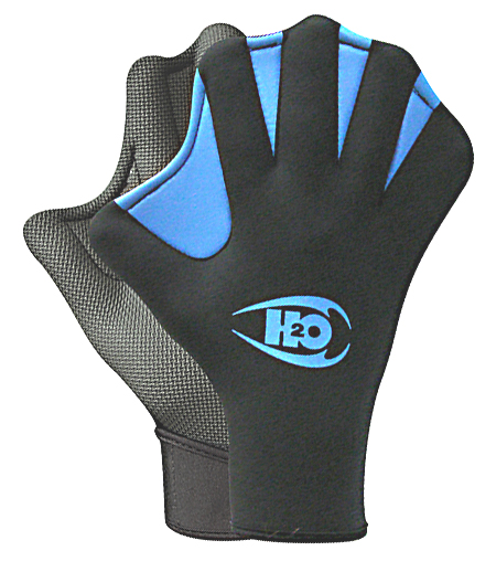
IMAGE - Scale Shape & Form - Gloves
As my object is a glove I've set out looking for all different types of glove. I've collected a broad range to help spark ideas.

Golf glove.

Cycling glove.

rubber glove.

Baseball Mit.

Driving glove.

Boxing glove.

Industrial glove.

Hockey glove.

Ice hockey glove

Ski glove.
Diving glove.

Fingerless glove.

Foam finger glove.

Leather glove.

Lace glove.

Baseball glove.

Biker glove.

Dusting mit.

Flame retardent glove.

Gauntlet.

Bird handling glove.

Kendo glove.

Goal keepers glove.

Oven Glove.

Gardening glove.

Weight lifting glove.

Woollen glove.

Rock climbing glove.
TOP 10 THINGS - Title Sequence Test 4
This is the first render of a completed sequence. Completed in the sense that there is 60 seconds of content. The animated bears and type aren't in this render however it it gives a basic idea for what I want to have by the end of this project.
Looking at the static assets as the test plays through I can almost see how I would like them to being animated and moving. The next step for me now is to animate these shorter lasting images in the sequence to keep up a go consistence of animation.
A problem I can see happening is shortage of time to actually animate the majority of the images like I have done in the 4 environment scenes prior to the montage of bears. I'll have to consider other alternatives to get around this.
Thursday, 26 January 2012


Tuesday, 24 January 2012
IMAGE - Type as Image - Quote 3 vectors and process
This was the original drawing, which I then scanned in and vectored parts of it.

Initially I live traced it and some parts had a really nice rough quality to them which I kept in the design but others needs tweak and re-vectoring to make them legible.

TOP 10 THINGS - Title Sequence Test 3
I've applied some type to the four scenes that make up the main part of my sequence, They all do pretty much the same thing which is fade in and enter - drift - fade out and exit. I've varied them slightly by changing the directions they enter and how they exit to avoid a stiff monotony.
The type needs to be moving slower in parts and I think the case is that I've made the type have to travel too far to make it an effective animation. I'm going to shorten the distance of the keyframes to see if it makes and improvement.


Subscribe to:
Posts (Atom)