Monday 28 February 2011

CALL FOR ENTRIES!


Letter, Word, Sentence, Paragraph will break down the study of type into a systematic progression of typographic relationships using content, examples, interviews, and real-life inspiration. Denise Bosler LLC is currently soliciting submissions of typography-based work for this upcoming book being published by HOW books. Any design/art that has a typography focus is eligible. Posters, brochures, logos, stationery, annual reports, web sites, magazines, advertising, packaging, t-shirts, custom typography, custom fonts, you name it, we want it.


http://www.graphiccompetitions.com/graphic-design/typography-design-call-for-entries


This is the link to the full contest briefing. I've pasted some of the content to this post so i can refer back to it easily and check the criteria that they are looking for alongside the brief set for us.

Tuesday 15 February 2011

Collection 100 - final outcome, Book of nets

I went for the Japanese stitch bound book for this book as each page would have to be printed single sided otherwise when you cut out a net it would damage the nets on the reverse side. This binding is easy and gives neat and tidy results.


Each net has an individual number between 1 and 100 so when the audience look in the second book for reference they can easily navigate and find the net(s) they need.


Photoshop Software Brief - Final Outcome


These are the final pieces in response to the photoshop software brief. Using mostly the techniques shown to us in the workshops i played around with altering the hue and saturation on different layers to get this vivid violet which was my given colour. then i using the shape tool to create circles and elipses and positioned them so they look like the content of the coke can is over flowing or bubbling and in one case beading with condensation. to get a more realistic effect i toggled with the opacity of the circles to give them different shades and densities.
The bright yellow under neath is from the original photos which were taken on a white table with two lights each having a coloured gel filter over it to create a sort of gradient from violet to yellow, this also explains why there are green blends in some of the pictures.


I made these two a bit different and simplified what i was doing to them to see how they would differ to the rest. They give the set a bit more variety and they seem more dramatic than the others. This pair is in your face slightly whereas the rest draw you in more as there is more detail.


Friday 11 February 2011

Visual Language - Type and Grid.


Technical terms to do with type.

  • Leading - the spcae between the base line of the first line and the cap height of the next line 
    • Shown as (for example) 10/14pt. 10 = the font point size, 14 = the leading point size.
      • 10pt font + 4pt leading = 14pt line feed
  • Pica ans Ems (very confusing)
    • a Pica Em is 12pts always
    • things can be measured in Ems. When you indent a line or paragraph the size of the indent will be 1 Em x the point size your body of type is written in.
  • Ligatures - when two letters join.
  • Kearning - specifically the spacing between a pair of letters - example:  1 958  1958
  • Reversed out - when text is reversed out of the back ground colour sometimes you may have to change the kearning so it doesn't bleed out.
  • Tracking - the spacing of all the letters.


The Grid.


  • Used a lot in editorial designs.
  • Grids for different functions - help the reader read the words - example: Theatre script.

From this session we were given the task of pairing up and using a measure to note different point sizes within the same article of a magazine or newspaper of our choice.


New package and product design

The feedback from the critique clearly pointed out that my product needs a better package and the product it self needs to be in a different format so i redesigned the deliverable.


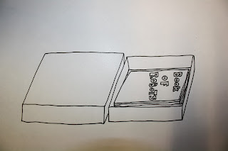
For the box i thought a sliding tray would be suitable as I am now going to create a book to go inside. The box would only need to be as big as the biggest net that I design for the robot parts which is about A5 or A6.
The box above has 2 separate trays which i thought i could try attaching together inside so they don't have to come out all the way. Each try would fit one book so the box would be either A4 or A5 depending on the necessary size for the book.
The box below is just a singular tray and would have both books one on top of the other, this idea seemed a bit bland I'm more drawn to the double tray idea.


The concept of the books is that there is a book of nets that you have to cut out and make the parts yourself and a book of 100 different robots that can be made from these parts being put together in different sequences.


Inside the book of possible robots would be 100 pictures and a reference number to the parts, each part would need to have a number between 1 and 100 and under/next to each image would be a key as to which parts are being used written down as numbers.


Still undecided on the layout for the book.