Monday 31 October 2011

Type Workshop 2

This session we moved on from a word to a sentence.

We briefly reviewed the last workshops key points

- choice
- serif, sans serif
- case weight
- size
- composition


Kearning

We discussed what Kearning is and where it came from and how it affects type.

Kearning in short is the space between two letters in a word.
Why do we need it? The group thought it was to do with legibility within different fonts and typefaces.

Computers have a preset kearning for each font - default kearning may not be communicating the tone of voice.


The spacing of the letters - asking for visually even space between them to get consistency.

Computers are good at this but not amazing.

Examples where you will need to kearn yourself

- logo
- branding

Has to be done because your logo and brand name has to be perfect.

Exercise 1 - your fist name sans serif, your second name serif - adjust the kearning.


Fonts used - Century Gothic regular, Cambria regular

They're only subtle differences but I think my name is well kerned to begin with.


No letter were able to overlap until the computer was used because it was based on metal type.


RAILWAY

the space between the L and the W is much larger than the spaces between the rest of the letters. However the letters are as close as they can be without them overlapping into each others spacing as if they were still metal letterpress pieces.

Changing the kearning is about making the word feel better and sit better on the page or screen.


Hiearchy of type (order of type) 

For example - you would put the information for a concert like this...

ABBA - Town Hall - £3.50

...but you wouldn't put it like this...

Town Hall - £3.50 - ABBA
£3.50 - Town Hall - ABBA

...this is to do with the way in which we receive information and how we respond to it. We see the Name of the artist or event first and become interested in the events whereabouts and price to attend.


The eyes are separate from the brain - the eyes look, the brain watches what the eyes see

Reads 1 2 3

We did a blink test, where you close your eyes and open them only briefly, for a split second and then say which of the words you read first.

Reads 2 1 3

We read 2 first because of the spacing around the word.

Reads 1 2 3

Size, weight and position control Hiearchy.

Reads 1 2 3 4

4 is the first thing you look at but 1 is the first thing you read. This is because your brain will read and recognise the easiest things to read first.

Reads 1 2 3 vertical 4 upside down 4

Similarly with this one the vertical 4 is slightly easier to read than the upside down 4 so we read it in that order despite seeing the other word first.

Reads 1 3 2

We read it this way because lower case lettering is generally easier for the brain to read and process but we notice the 1 first because its the first thing we see but then our eyes skip out the 2 and read the 3. We recognise shapes when reading, the word 3 has a more defined shape than the uppercase words.


Exercise 2 - 1 font 6 or 7 words from a song - how clever can you be making it read the right way even though you've got it wrong?


How do you break a sentence into two lines?

How do you break a sentence into two
lines?

How do you break a
sentence into two lines?

How do you break a sentence
into two lines?


The first two examples don't read smoothly and don't work very well but the third one does as it breaks the sentence up at its natural break. To find the natural breaks in sentences its often wise to say them out loud and listen for what sounds right.


Exercise 3 - use your sentence from the previous exercise and break it into two lines.


Tuesday 25 October 2011

'GOOD IS' - Formats/Methods/Considerations

As a follow up to the Concept Proposal crit we had to refine our rationales and from this new specific rationale we had to come up with 5 formats, 5 methods of print and 5 considerations for print so we can then go away and investigate them by applying our designs to these lists.


5 FORMATS

1. A1 - poster - short run 50-100
2. A5 - leaflet - 5000-10000
3. A4 - magazine/lookbook/publication
4. Wood/Plastic
5. Canvas sheeting (waterproof)


5 METHODS OF PRINTING

1. Litho
2. Screen print
3. Digital
4. Laser cut
5. Pad print


5 CONSIDERATIONS

1. packaging and nets
2. die cut
3. emboss/de-boss
4. vinyl prints
5. 1920's and 30's layouts, stock and colours

Tuesday 18 October 2011

Software Workshop 4 - Practice before print.

This is the last session of workshops, for What is design for print?

So far we have looked at Photoshop, Illustrator and Indesign.

This session is going to be about putting the things we've learnt into practice and so we can test how much we've learnt.
The aim is to creating something using the resources in the shared user file that will be suitable to send to print.

We were given this Indesign file to go over and check.


The first thing we noticed that was wrong was that the tree image had no link to it so it would cause problems when printing. To resolve this issue you would have to find that image and save it in the same file as the rest of the images to make the link.


Secondly, the first page of the document hasn't been bled off the page like the others and the tree image extends further than the bleed will allow so its again not printable.


Thirdly the number of printing plates was too many. The specification for this document allows just 5 inks and there were 2 extra spot colours which would need to be deleted from the swatch palette.


The fourth mistake was that the colour blue being used on the third page of the document is an RGB colour not CMYK which means it will come out differently when printed. You can change this by double clicking on the swatch and change the colour mode to CMYK in the pop up window.


The fifth, sixth and seventh mistakes are all to do with the images of the birds on the second page of the document. 


Bird 1 has been scaled down so the effective resolution has gone up which causes problems when printing, this needs to be amended in Photoshop. This means your working with an unnecessarily big files and that Indesign has more to do when sending it to the printer.


Bird 3 is still in RGB colour mode not CMYK so the colours will not print the same as you see on screen. You can change this by opening it up in Photoshop and 


Bird 5 is using the wrong resolution, its still in 72dpi which is for screen wen it needs to be 300dpi which is for print. This can easily be changed by holding down the alt key and double clicking the image and it will open up the image in Photoshop where you can change the resolution in the image size window. However Photoshop can only work with the original image so re-scan it or upload it.


Lastly, the text on the bottom of the last page is using the registration black instead of the normal black so that text will be printed on all the coloured plates which isn't what you want. The registration black is just for trim and print marks.


A lot of problems are cause by badly prepared images in Photoshop and incorrect application of colour in the document.


PREFLIGHTING (last minute checks before takeoff)


You can leave it as an Indesign file which is up to the printers, they may say its fine to work with. You will have to send all the images and fonts used on the document as well otherwise the document wont work when they try to print it. The best way to save them is to keep them all in folders, Indesign will usually create these folders for you.


Before printing you need to 'Package' your file, this will gather all your images, fonts and links along with your Indesign document. Before you click the package button in the pop up window you are presented with lots of information about the document the images, the fonts etc so you can see if everything is ok for it to go ahead and be printed. It will give useful information on where the files are on your computer so you can find them and also where they are in the document. This is a good opportunity to go over everything to make sure its all in check.


Saving as an Adobe PDF


File - Export - Abode PDF for print - save - Adobe PDF presets - press quality - export


it may take some time to export if there are lots of images or lost of information being compiled into the file.

Type Workshop 1

I found this type session very interesting and it really pointed out a lot of gaps in my knowledge of type and type history.
The workshop ran sort of like a conversation or debate about different peoples perception of how type represents speech or the spoken word.

Type is given no character or 'voice' through decorating it, decorative type is just there to look aesthetically pleasing and the catch the audiences attention, but if the content and aesthetic are out of context the text becomes obsolete.

Graham took us through a few exercises so we could se how we think about type and the voice behind it.

Firstly we typed out our own names and we could use any font, weight or point size available.


This exercise was to see how the voice of the word we've written actually relates to us as a person or designer. It was quite fascinating to see how many people who are quiet or loud or talkative or calm had arranged their name in a way completely different to their personalities.


From here we did a some more experiments using the word 'dog'.

Angry dog. I used a Bold weighting and maybe the point size as big as I could to make the word stand out more and seem agressive. When looking around at what others had done, most were similar however one or two had thought to turn the canvas to landscape and fill the entire page.


Pissed off dog. I used a lighter weight making the font more condensed as if the word was wound up tight. I found it difficult to represent this one although the more I look at the word the more it looks like the descender of the 'g' looks like a mouth of the dog as if its growling through its teeth


Shy dog. I made the text as small as possible without it becoming unreadable and placed it in the top left. Whereas most people did a similar thing and placed the text in the bottom right corner of the document.


I'm still unsure of which module I will choose for the optional module but I did find this session really interesting and useful. I'm going to look more into the world of type to see if my interest continues.

Thursday 13 October 2011

'GOOD IS' - Concept and Rationale

Now that the packaging has been done and critiqued we're going back to our concepts and refining them to pitch them to the rest of the group next wednesday.

Fred set us the task of creating 4 A2 sheets

1 with the concept of our proposal - this needs to be backed up with proof, facts, statistics the make it a solid concept to go forward with.

1 sheet with contextual references of where the design is headings in, basically mapping the design direction for the concept.

an 2 sheets of initial ideas, mapped/drawn out, mocked up and presented neatly.

Also need to bring in samples of print and examples of work that is already in use that demonstrates my aims with the project.

'GOOD IS' - Logos applied to Packaging

Finally the last stage before the next presentation and crit.

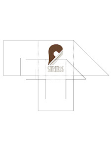
I've applied the logo to all four of the packages but I'm running desperately out of time so I have barely thought about how I could add more to the designs of the package and make use of the insides or the way in which the package opens up to present the audience with another part of the design.


Printed, cut out, folded and stuck together the packages look ok but I still feel that there is more to be done. Hopefully I will get some good constructive feedback on my designs to make them more solid and refined.


The bottle net was slightly misprinted causing the 'S' of the word 'Strings' to be wrapped round the package. This was not my intention and was most probably cause by lack of attention before sending it to print.


On a positive note, I'm pleased with the stock, it holds to ink well and work well against the colour of the ink.


'GOOD IS' - Stock choice

Choosing the stock was easy, I already had a certain stock in mind from a piece of print that I had found in my ukulele case which I though would work well with the colours of my logo but you always have to try things out to see what you can and cant do.


I took a range of stock two dull and dark, two bright and colourful and two light and soft.

These were the results.


The one on the bottom left seems to be the most legible and visible. Some of the darker stocks obscure the text completely of just make it too difficult to make out.

'GOOD IS' - logo development

Now I've got my logo developed by hand its time for some proper fun stuff.


I feel as though I spent too much time developing my design by hand so when I got to vectoring my work I wasn't able to produce as many variations as I planned to originally.

I was hoping to get about 100-150 variations and experiment more with colour, but running short of time I stuck a simple Light shade of brown which I got from a packet of ukulele strings that I had bought for my own ukulele.


This is the design I went for in the end, it's a lot more simple than the one that was chosen in the crit but it still has the essential qualities that made it stand out then, plus I have develop the typeface further.

I was looking into 1920's and 30's typefaces as that was the George Formby ukulele popularity boom and I was very interested the art deco fonts and typefaces.


These are some basic designs that did really quickly to get the basis for what I wanted to type to look like. I got a few opinions from the group and most said that the one on the bottom right seemed to stand out more for them and was more in context with what I had been researching for the development of my typeface.


'GOOD IS' - Logo Development

The next task set after the mountain of logos that we design was to focus on just one and develop it further taking it onto the computers to vector it and finally apply it to 4 different nets. Effectively we are now packaging our 'goods'.

The logo I went on to develop was defined by the crit of the 150 logos that we all presented my chosen logo was this one


my course mates criting my work stated that they liked it compositionally and that it incorporated my 'good' they advised however that I look more into developing the typeface and maybe make it follow to direction of the strings within the logo.

So from here it was back to square one with designing however this time I was focussing on just the one logo and creating variations of it to see which would be the most effective as a logo before applying it to the packaging.


Initially I replicated the logo they had chosen but it felt too sophisticated and complex, too much was 'going on' with it visually. I needed to simplify it and make it bolder. So instead of having the strings coming down from the symbol I decided to lay them going diagonally underneath.


I found it hard to choose one of these variations to take on to the computer so I asked a for a few opinions and most said third row down on the far right.


'GOOD IS' - 150 logos

In response to the task Fred set us I only managed to get 96 logos done, which although not the required amount to complete the task i felt it was an achievement on my part as I've never done so many different designs in such a short space of time. I have done that many variations of a handful of designs before but with this I really tried to push myself for differing ideas with each logo.


These are not displayed in chronological order but I definitely noticed that the more i was designing the longer I spent on each logo, the better I got a drawing, my curves were smoother my liners were straighter (didn't use a ruler for a lot just to save time and get my ideas down) and I had begun to make use of the different thickness of pens more and the possibilities of filling certain parts in and reversing out others and so on.

The task was challenging mainly due to the time we had to complete it and this is evident as I only managed 96 however I did get some good drawing skills out of it and it got me back into the designing mindset that got a little left behind at the end of first year and my work placements.

This does now provide a bench mark for me and shows that progression of how to work as a student on this course in second year apposed to how I started off working in the first year.