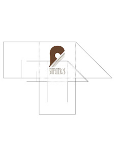
Finally the last stage before the next presentation and crit.
I've applied the logo to all four of the packages but I'm running desperately out of time so I have barely thought about how I could add more to the designs of the package and make use of the insides or the way in which the package opens up to present the audience with another part of the design.
Printed, cut out, folded and stuck together the packages look ok but I still feel that there is more to be done. Hopefully I will get some good constructive feedback on my designs to make them more solid and refined.
The bottle net was slightly misprinted causing the 'S' of the word 'Strings' to be wrapped round the package. This was not my intention and was most probably cause by lack of attention before sending it to print.
On a positive note, I'm pleased with the stock, it holds to ink well and work well against the colour of the ink.


No comments:
Post a Comment