
Now I've got my logo developed by hand its time for some proper fun stuff.
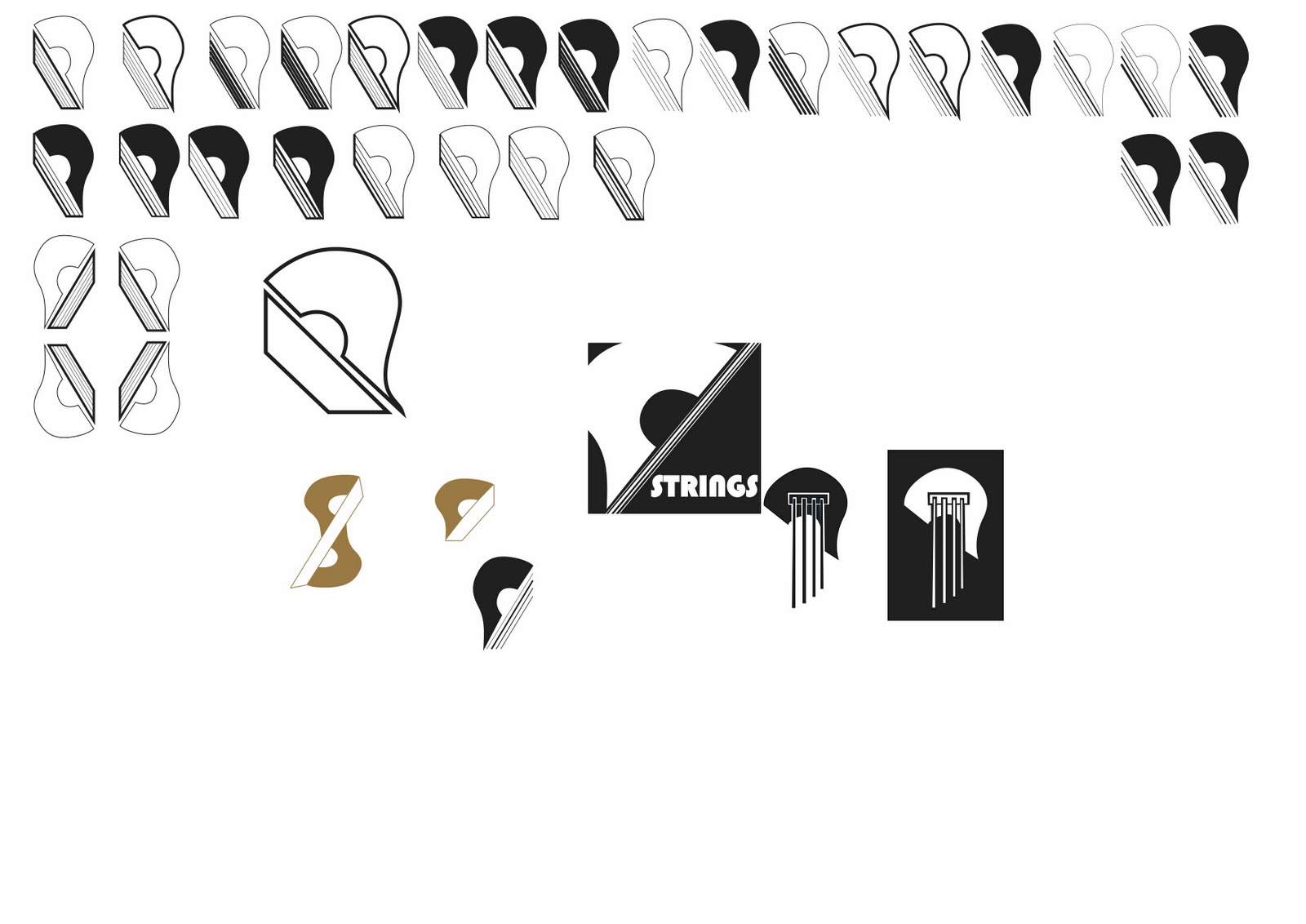
I feel as though I spent too much time developing my design by hand so when I got to vectoring my work I wasn't able to produce as many variations as I planned to originally.
I was hoping to get about 100-150 variations and experiment more with colour, but running short of time I stuck a simple Light shade of brown which I got from a packet of ukulele strings that I had bought for my own ukulele.
This is the design I went for in the end, it's a lot more simple than the one that was chosen in the crit but it still has the essential qualities that made it stand out then, plus I have develop the typeface further.
I was looking into 1920's and 30's typefaces as that was the George Formby ukulele popularity boom and I was very interested the art deco fonts and typefaces.

These are some basic designs that did really quickly to get the basis for what I wanted to type to look like. I got a few opinions from the group and most said that the one on the bottom right seemed to stand out more for them and was more in context with what I had been researching for the development of my typeface.
No comments:
Post a Comment