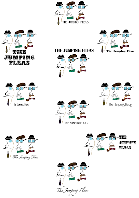
I went through the fonts that are already on Illustrator and searched for a few new ones from www.dafont.com and compile them all together the see which would work best against the illustration logo of the three faces.
Here I've arranged them so I can see how each one works individually with the image so I can compare them and pick out the ones which are working.
I narrowed it down to about ix typefaces then asked some people in the year which ones they preferred and these two came out on top. I see no reason not to use both type faces so long as I keep it consistent with where I use each one.
For example, I will use one on the packaging and maybe use both for the publication and the flyers.
These are both from www.dafont.com.


No comments:
Post a Comment