Sunday, 20 November 2011

'GOOD IS' - Presentation Boards Development.

As I'm now proposing my publication and not actually printing it I needed to change my boards and consider what would be best to explain my project instead.

At the moment I have boards for range, packaging, promotion, publication and proposals. Looking at other peoples blogs they have considered things like concept, context, focus, development etc. I now have room to include a board that will better communicate my project.


Original Boards - range, packaging, promotion, publication, proposals

New Boards - range, packaging, promotion, context, proposals 

RANGE

This will be a collection of photographs of my final printed range of products, compiled and presented neatly on the board just to show the project as a collective response.

PACKAGING

This board will focus on my work with packaging looking closer at the nets used, the designs that I used specifically for the nets, the proportions and considerations of the packaging in terms of scale, appropriateness of stock and the relation between the packaging and the content.

PROMOTION

This will present any products and materials that I've produced or worked with the create the promotional media for this project. It will cover things like posters, flyers, t-shirts and give aways as well as the development of the layouts and designs.
On top of this It will have another focus of print finishes and processes, mainly foil blocking, digital print and screen print.

CONTEXT

A visual board that shows were the work I've produced will feature and function. Key points will be the method of delivery, the places the band will feature and any other visuals to represent the range in action.

PROPOSALS

Again this will be a visual board of further considerations and developments of the project. Subjects will include to Publication that I proposed to create early on but had to cut short, a printed canvas tent for a pop up promotional gig in Leeds city centre, and further development of design work.


The boards don't have to be beautifully printed however I've researched into it and its actually cheaper to get them printed in the digital print facility than in the mac suite, so I'm aiming to have everything compiled on to a file to print for the hand in.

Saturday, 19 November 2011

'GOOD IS' - Flea Posters & Foil Blocking.


These are the prints of my promotional posters and flyers. The gold foiling came out really well, as I don't have access or funds to get real foil blocking done I've used the foils from the screen print studios and ran it through the laminator, it works just as well. The stock being such a deep shade of red really brings out the gold foiling.

The logo however is a very dark which makes it hard to see from a distance especially against the gold. I will perhaps change the design so its just type as I cant get the logo to print any brighter.


You can see here that the logo is more legible up close but people wont be viewing the posters so closely when they are being used so this renders the logo useless.


I've foil blocked the flyers as well as the logos on them came out better than the posters did and it works really well. However if I were to be realistic this would cost a lot extra for such a big print job as these would be printed in lots of 5000 or 10000.


Just a nice experiment with the left over foiling, It actually looks like printed/engraved gold plating.


'GOOD IS' - Printed Range.

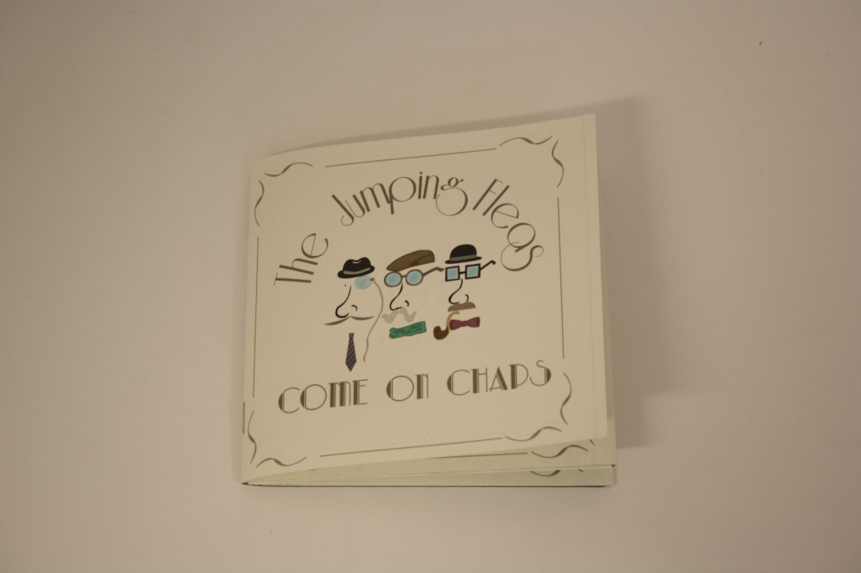
This is the printed range so far. The prints came out really well although there are a few amendments and improvements that could be made.


The cover for the CD doesn't quite reach all the way around which is a bit confusing as its the exact measurements from the original that I got from the nets books in the studio.

You can see on the left page there is a vertical black line where it should have been cut, I gave it a bit extra so when closed it looks like it covers it perfectly, however this has a knock on effect of making the design on the covers look like they have been squashed up to spine of the CD.


The back cover doesn't actually look too bad.


Some of the songs on the back aren't legible enough because of the point size and the font used. The P's and D's look too similar. I'm going to replace the font with the Riesling font that I've used for the bands name.


The 'Flea-shirt' box came out well and the shirts I've bought fit well inside but then need to be folded accurately and in a certain way to make then fit properly. The only real issue with this package is the stock, Its a really good print however its too flimsy and unstable to really support the content. I've been to the Library though and found another sturdier stock to use for a reprint across all the products.


Managed to find some plain coloured shirts in Primark last minute which was really helpful.


'GOOD IS' - Chapinabox package and content.

The 'Chapinabox' idea is that fans would come to gigs and tour dates and receive them, either on the way in or the way out, the choice is up to them, and they would pop out the designs and put them on to turn themselves into make shift chaps. This aim is to create a more fun and silly atmosphere at the gig to show people how much fun Chap Hop is as its such an infantile genre of music. Infantile being both young and childishly fun.

Then after these give aways the 'Chapinabox' would be available online and in some shops. The giveaway will promote the events by making people want to come for the novelty of having one.


Each print of the net would need to be die cut as the whole at the front allows the templates inside to show through. I could have easily just left the design on the outside of the box but I thought this would be a good opportunity to incorporate another type of print finish consideration.


The boxes would be short run prints as they are giveaways and the ones purchasable online would be printed to a much higher quality to make them last longer as people will be paying for them.

Each box would contain 3 A4 prints of these templates so the audience has a chance to create there own chap variation. The giveaways at the gig will be perforated so the audience can pop them out easily at the venue


'GOOD IS' - Tea Cup package aka 'Flea Cup'

These are the nets and designs for the 'Flea cup'. The final crit made a point that merchandise such as this would be best for when the band would be taking off properly, this is a very valid point however I'm still going through with ideas like this as I feel this module is more about how creative you can be than how rational you can be with things like this.

Other products that I have documented an considered with this are daft and fun things such as teabags and teabag hooks, elbow patches and printed custom tweed jackets. All of which are either unnecessary or expensive.


The teacup itself would be pad printed as its 3D object and not flat. Inside the packaging would be some sort of confetti or supporting card to ensure the products protection after purchase.

These are some ideas for the designs that would go onto the cups.
(each row is a representation of 1 cup viewed from each side and from the front)


'GOOD IS' - T-shirt package & labels aka 'Flea-shirts'

Whilst working with most of the nets I was using a  brown back drop as I was planning to print on a dark stock, however after test printing I had to change the stock to something more suitable. I'm now using Antique white from the Library as its affordable and has a nice light grained texture which gives the prints a more vintage look.


Here I've removed the back drop which makes the designs more distinguished but once printed it wont be as harsh.


As I'm going to print some T-shirt properly I though it would be a nice touch to add a custom label to them.


They will be double sided as its a bit plain without nothing however I don't want to clutter up the label. Also these are designed just for the display and authenticity of the product. It will be discarded relatively soon after purchase so the designs and quality of print wouldn't need to be perfect of spectacular. 


'GOOD IS' - CD designs aka 'FleaD'

To make things quicker for myself with the designs I selected some suitable ones from the books of nets and ideas that are available in the studio.
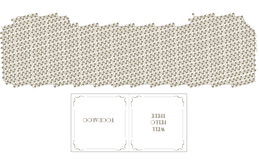
This one I chose for the CD because when its folded it creates 2 pockets which gave me the idea for using one for the disk and the other for a booklet of poster. I'm going to fold up a poster for the hand in because of the time that I have to produce everything and propose the booklet as a development of the product.


Looking back at the concept development tasks when we applied designs to a set of nets for packaging I noticed that people were using the inside of theres as well as the outside. So with this in mind I created a pattern for the inside of the pockets that the CD and poster to go in.


I chose a pipe to as in previous works from other students I've seen both moustaches and glasses and I wanted to avoid any repetitions of others work. Other considerations for patterns were bow ties, hats, monocles, ukuleles, fleas, tea cups and T-shirts. The idea is that they could vary for each package and be relevant to the content. For now I've stuck with using the pipes for all the packaging due to how much I cant get done in the time given.


Because there was a lot of blank space inside the CD package it created a lot of room for designs and imagery to be used. Initially I wanted to use the photos from the shoot of the fake band but this would have been too long winded to create and difficult to edit. I want to readdress this after the project however and keep creating designs for the band and make it more authentic. Also it would just be a bit of fun.

For these blank spaces I dissected one of the fleas logos and separated them by the different items to create interesting visual collections on each page.