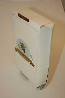
This is the printed range so far. The prints came out really well although there are a few amendments and improvements that could be made.
The cover for the CD doesn't quite reach all the way around which is a bit confusing as its the exact measurements from the original that I got from the nets books in the studio.
You can see on the left page there is a vertical black line where it should have been cut, I gave it a bit extra so when closed it looks like it covers it perfectly, however this has a knock on effect of making the design on the covers look like they have been squashed up to spine of the CD.
The back cover doesn't actually look too bad.
Some of the songs on the back aren't legible enough because of the point size and the font used. The P's and D's look too similar. I'm going to replace the font with the Riesling font that I've used for the bands name.
The 'Flea-shirt' box came out well and the shirts I've bought fit well inside but then need to be folded accurately and in a certain way to make then fit properly. The only real issue with this package is the stock, Its a really good print however its too flimsy and unstable to really support the content. I've been to the Library though and found another sturdier stock to use for a reprint across all the products.
Managed to find some plain coloured shirts in Primark last minute which was really helpful.


No comments:
Post a Comment