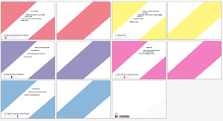
This is the original layout that I uploaded to my blog. I used bright colours and a consistent layout to make it easy to navigate the manual and keep it interesting as there would be a lot of information in it.
The manual lacked pretty much all content at this stage.
I've now given it a contents page to quickly summarise the topics that my manual covers and colour coded them to match the background colours on the manuals pages so people reading this can find the topic they want to look up easily.
I then decided to format the text so that it follows the direction of the diagonal strip so its more visually engaging. To fit more content in and to give myself more creative space I've add another 10 art boards to work on giving each topic room for more detail. I will add more art boards if need be.


No comments:
Post a Comment