This was the first time I've really spoken to Andy one on one so I didn't know what sort of feedback I'd get from him as he'd be seeing my work up close for the first time.
The tutorial went really well and we overran which was a massive help for me because I get loads of really good quality direction for my work and advise and ideas. I came away feeling like I'd gotten the feedback I'd been searching for in my crits but never got.
Talking through my briefs, I find, always helps me articulate myself better and understand my own work better. The briefs almost develop as I talk about them and Andy and I got a good dialogue going quite quickly.
First up was my collaborative brief with Marty. I explained the trouble and development the logo had gone under and the mission statement of the company. He seemed to think it was going well judging from his reaction. When I was going through the concept of the company name he touch on the meaning of the word Obediah - servant of God - being a suggestion that we aim to create a following of some sort which he approved as an idea. I've taken this into consideration and I think it would be an interesting insight into how we want to expand and keep in touch with our existing customers via social media.
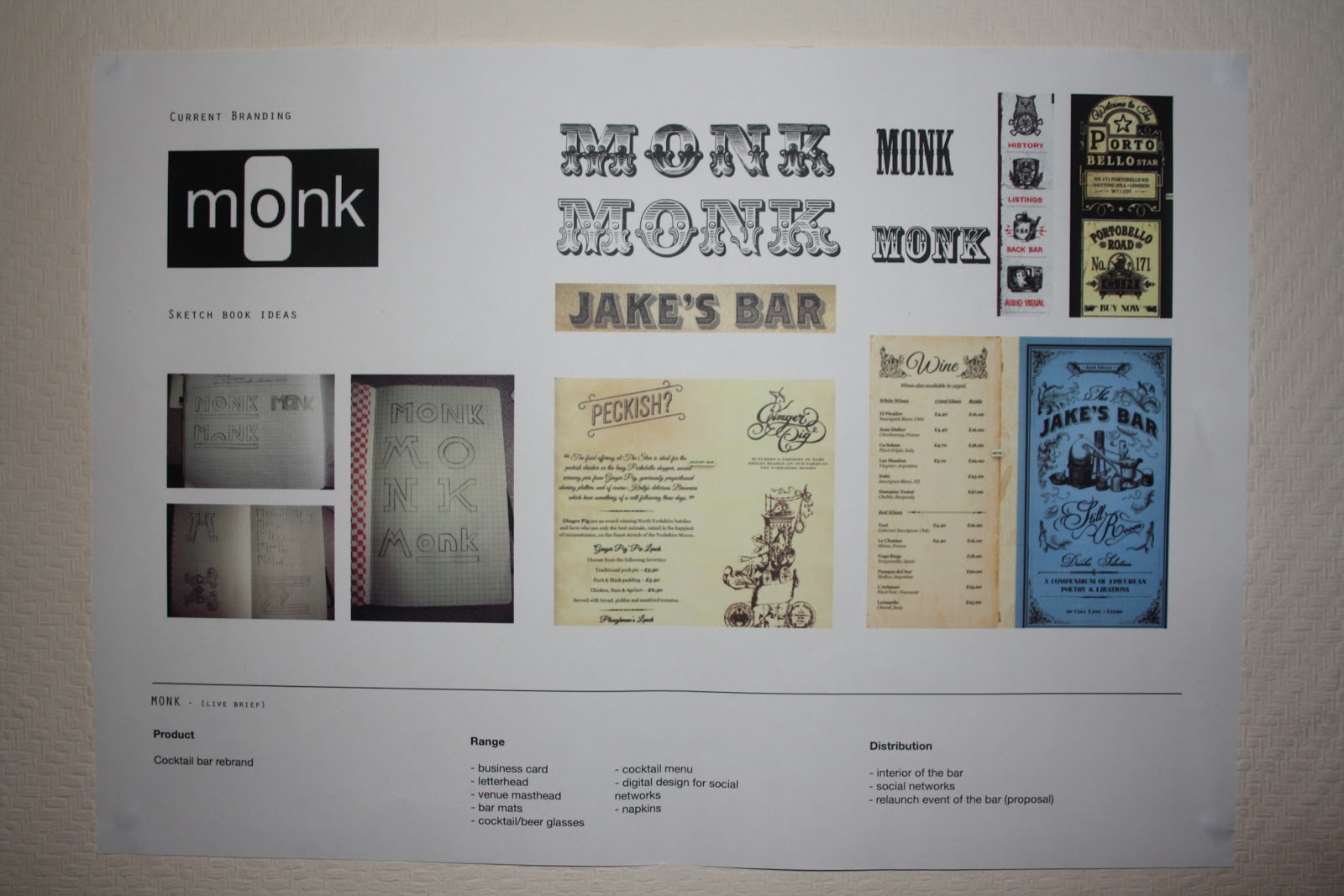
Recently I've realised that the MONK brief needs to be much further a long and I think a big thing thats holding me back is the lack of direction. I've got ideas but no real information thats helping me pin down whats appropriate and necessary for this brief and also the client. The brief could have so many deliverables and so many different responses at this point that Its a struggle to design for it. Andy advised me to get a few of my best ideas down and present them to Mannie (the client) and get his opinion. Going over the ideas I've already had with the brief Andy has helped greatly with my deisng direction. I just need to get it rolling.
For the VIEW brief I feel that I have a really concrete concept for the design however it needs to be more innovative and cutting edge to reach it's true potential. I just need to go back to the drawing board and tweak bits and try a few other ideas. Time is obviously a factor and I need to begin getting the content together and producing prints. Andy has left me with some really interesting ideas and useful links to look into stock choices and print finishes so I've got a lot of fun experiments to come in the next 2 weeks with getting the processes down and developing my print knowledge and skills.
The BIKOLOGY brief is still in its early stages as the focus has been on the more substantial and valued briefs but we went over the feed back from the concept crit and discussed the possibilities for my design work. The word bikology is a bit of a gift as the o l o sit next to eac hother and look already like the wheels and seat of a bike. I noticed this at first with my initial logo design but Andy has suggested that I try a more subtle approach and incorporate different bits of imagery into the logo. He also mentioned fixed bike blogs and the cult followings and designs that come with them as they can be a great reference and guide on what to do and what not to do.
For my competition brief I've finally chosen the YCN Bacardi brief on the grounds that I like alcohol, I'm the target audience and I've had a lot of experience in night clubbing and working in clubs and bars. I'm really interested in the heritage of the brand and the ways in which alcohol is made and I want to approach this brief with a sophisticated tone of voice that has an undercurrent tone of humour to make the young audience of boys feel like men but remain amused. Andy gave me some starting pointers, food for thought.
Plan of action:
OBEDIAH
- apply logo across the branding
- get the branded collateral printed
- finalise specifications for photoshoot
- get all shirts needed for the shoot printed and ready
- get feedback on the shirt designs
MONK
- get ideas down to present the Mannie
- email Mannie pdf
- create imagery for printed collateral
- get content for menus from Mannie
- finish the logo and apply across the branding
- get brand collateral printed
VIEW
- develop typeface further and make more appropriate to the current branding
- get content together
- gather stocks for test prints
- experiment more with print finishes
- produce range
BIKOLOGY
- redesign and develop logo to be more subtle
- look at bike blogs and graphics for bike designs
- gather content for magazine
BACARDI
- research into the brand 1 day
- get ideas down for campaign 1 day
- choose idea and develop 1 day
- design the campaign and develop 1 day
- produce, amend, select and evaluate 1 day

Showing posts with label CRITS. Show all posts
Showing posts with label CRITS. Show all posts
Tuesday, 13 November 2012
Thursday, 8 November 2012
CONCEPT CRIT 2
I felt like I had developed a lot more design work for this crit so I was hoping to get some more formative feedback. I didn't however manage to provide up to date briefs or show the responses to the last crit which I think really could have helped and changed the feedback I got.

These are the new crit boards, I've kept the same format for consistency but I've changed the content.
The first part was interesting because it gave us all time to look around and see everyones work and what they are up to and leave brief informal comments on their work. I left 5 questions with my work which I wrote quite last minute but they were all concerns that I have about my work so far.
Questions:
1. For the BIKOLOGY brief, do you think the logo is appropriate/ good or would it be improved by keeping it typographic?
2. For the OBEDIAH brief (t-shirts) could you please pick your most preferred designs? (mark with a tick)
3. For the VIEW brief, does the 'holography' logo look like it's too much? If yes, should I stick to just the letter 'H' logo?
4. Do you think the iconography goes well with the MONK logo?
5. Please see the OBEDIAH logo board and follow instructions. (board below)
Marty and I put together a board for the logo development of our collaborative brief so we could get some opinions on it and the development from the previous concept crit.

I felt like this crit was a massive hit and that my designs aren't up to scratch. The concepts aren't there or are too weak and not obvious enough. There's also a lot of my work that people think could be more innovative.
Marty and I are going to readdress the logo for our collaborative brief. We're not goin gto scrap the current one but make it into a shirt design instead because people seem like it as on a shirt, it draws them in and looks cool but it doesn't function well as a logo and it's holding us back from completing the rest of the brief.
With the monk brief I really need to just get on with it and keep a better conversation going with Mannie to make sure I designing something he wants and thats appropriate.
The holography brief needs to be pushed forward and the type needs more development, the concept/ reason for the design is sound but the actually aesthetic needs to be more appropriate to the company branding and more original.
The bikology brief to again be pushed forward and the logo is too typical and obvious, I needs to be more innovative so more ideas and experiment needs to be done before deciding on a final logo.
I really want to be pushing the briefs forward right now and be collecting the content together for the publications and experimenting with print processes.
My first plan of action is to get the briefs updated and write up the concepts I've been working with so people criting my work can better understand what I've been doing and thinking about.
Thursday, 25 October 2012
CONCEPT CRIT 1
I felt slightly under prepared for this crit but I managed to print out boards for what I've done for each brief. Most people had just presented the design work they had done for 1 or 2 and some 3 briefs so I felt like I was on a similar level with the progress.


Open publication - Free publishing - More brief
I got some good and some bad feedback. The good feedback was really helpful because it was people giving me ideas for the briefs that are in there early development stages. The bad feedback basically just pointed out a lot of errors in my ways of designing for my main brief. So both kinds were good but I came away feeling a bit disheartened by it.

I like getting feedback on my boards its very direct and critical. It makes it much easier to understand which bits people are talking about on the formal feedback sheets.
For the MONK, VIEW and BIKOLOGY briefs I didn't have much to show in terms of design development but I have considered all of them and started getting ideas down. This meant that the feedback I got was mostly directed at the PCL brief which I think is a good thing as its the bulk of the work I have to show.


This is the feed back I got from the formal feedback sheets.
Comment on the extent to which the initial briefs have been considered with regards to conceptual development and scope for appropriate products ranges and methods of distribution.
- all briefs have been considered but ideas for method of distribution needed
- MONK - you need to consider what the client wants - illustrative type can still be clean cut
- consider the high end client base
- consider colour schemes and stocks
- develop more contextual research as inspiration
- try research into future trends, if its focused on trend you need to be ahead of the curve ask your buddy shaun for some research pointers
- thorough consideration have you thought enough about new skills (and others) to develop?
Comment on the extent to which the work presented demonstrates appropriate amounts of initial research from appropriate sources.
- an extensive range of research which is informing your design decisions
- BIKOLOGY brief - consider re-writing to work as a branding brief for Bikology shop and design publication work about bicycle anatomy in context of their promotional collateral. Currently seems a little confused/backwards
- there is no clear concept to the elements of the logo, need to either have real justification or get rid of the extra bits
- logo and type hierarchy needs to be addressed
- need broader research for brief 3 and the 4th look like they are still in initial stages
- BIKOLOGY - research into the format and content of publication
Comment on the practical investigation of design ideas, materials and skills have informed decisions relating to possible design solutions.
- obediah - already evidence of practical investigation
- monk - more work needed
(whoever was giving this feedback wasn't very helpful, they were just stating obvious things about whats in front of them and not giving any suggestions or comments that would help me move forward and improve the work)
- holographics - strong identity needed
- originality - risk of being boring if not done well - more visual development needed
- does the logo need to be so big? I think a more subtle approach is needed
- MONK move away from the decorative type - looks like scruffy American bar where you drink whiskey and dark rum. look at sans serif - minimal type
- MONK - have shop front mock up, think of what you need to propose not just the small print collateral
- OBEDIAH - think bigger - how can you make more plausible - don't just hunk about print designs - shop front, website not just social networks
Additional comments.
- view holographics - keep in mind, content could get complex - keep simple, structured, organised
- type in the logo needs to form a more hierarchical position - doesn't have a place
- consistency in typefaces - use the same in logo as when written out
- purpose of biology publication? - to promote or to stand alone?
- how are these briefs developing your skills?
- think about more digital media (website), maybe typeface design for MONK - more diversity needed
Clearly I've not been focussed enough, I've not been hitting the nails on the head properly and the nails are bent or askew. I'm going to have to readdress a lot of my ideas and really get concrete concepts down for everything I'm doing and produce more work focussing on developing specific skills and a broader range.
Subscribe to:
Posts (Atom)