Tuesday, 18 October 2011

Type Workshop 1

I found this type session very interesting and it really pointed out a lot of gaps in my knowledge of type and type history.
The workshop ran sort of like a conversation or debate about different peoples perception of how type represents speech or the spoken word.

Type is given no character or 'voice' through decorating it, decorative type is just there to look aesthetically pleasing and the catch the audiences attention, but if the content and aesthetic are out of context the text becomes obsolete.

Graham took us through a few exercises so we could se how we think about type and the voice behind it.

Firstly we typed out our own names and we could use any font, weight or point size available.


This exercise was to see how the voice of the word we've written actually relates to us as a person or designer. It was quite fascinating to see how many people who are quiet or loud or talkative or calm had arranged their name in a way completely different to their personalities.


From here we did a some more experiments using the word 'dog'.

Angry dog. I used a Bold weighting and maybe the point size as big as I could to make the word stand out more and seem agressive. When looking around at what others had done, most were similar however one or two had thought to turn the canvas to landscape and fill the entire page.


Pissed off dog. I used a lighter weight making the font more condensed as if the word was wound up tight. I found it difficult to represent this one although the more I look at the word the more it looks like the descender of the 'g' looks like a mouth of the dog as if its growling through its teeth


Shy dog. I made the text as small as possible without it becoming unreadable and placed it in the top left. Whereas most people did a similar thing and placed the text in the bottom right corner of the document.


I'm still unsure of which module I will choose for the optional module but I did find this session really interesting and useful. I'm going to look more into the world of type to see if my interest continues.

Thursday, 13 October 2011

'GOOD IS' - Concept and Rationale

Now that the packaging has been done and critiqued we're going back to our concepts and refining them to pitch them to the rest of the group next wednesday.

Fred set us the task of creating 4 A2 sheets

1 with the concept of our proposal - this needs to be backed up with proof, facts, statistics the make it a solid concept to go forward with.

1 sheet with contextual references of where the design is headings in, basically mapping the design direction for the concept.

an 2 sheets of initial ideas, mapped/drawn out, mocked up and presented neatly.

Also need to bring in samples of print and examples of work that is already in use that demonstrates my aims with the project.

'GOOD IS' - Logos applied to Packaging

Finally the last stage before the next presentation and crit.

I've applied the logo to all four of the packages but I'm running desperately out of time so I have barely thought about how I could add more to the designs of the package and make use of the insides or the way in which the package opens up to present the audience with another part of the design.


Printed, cut out, folded and stuck together the packages look ok but I still feel that there is more to be done. Hopefully I will get some good constructive feedback on my designs to make them more solid and refined.


The bottle net was slightly misprinted causing the 'S' of the word 'Strings' to be wrapped round the package. This was not my intention and was most probably cause by lack of attention before sending it to print.


On a positive note, I'm pleased with the stock, it holds to ink well and work well against the colour of the ink.


'GOOD IS' - Stock choice

Choosing the stock was easy, I already had a certain stock in mind from a piece of print that I had found in my ukulele case which I though would work well with the colours of my logo but you always have to try things out to see what you can and cant do.


I took a range of stock two dull and dark, two bright and colourful and two light and soft.

These were the results.


The one on the bottom left seems to be the most legible and visible. Some of the darker stocks obscure the text completely of just make it too difficult to make out.

'GOOD IS' - logo development

Now I've got my logo developed by hand its time for some proper fun stuff.


I feel as though I spent too much time developing my design by hand so when I got to vectoring my work I wasn't able to produce as many variations as I planned to originally.

I was hoping to get about 100-150 variations and experiment more with colour, but running short of time I stuck a simple Light shade of brown which I got from a packet of ukulele strings that I had bought for my own ukulele.


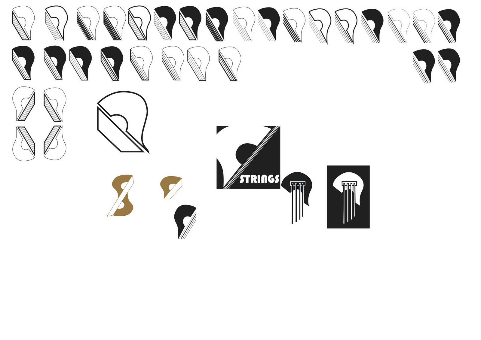
This is the design I went for in the end, it's a lot more simple than the one that was chosen in the crit but it still has the essential qualities that made it stand out then, plus I have develop the typeface further.

I was looking into 1920's and 30's typefaces as that was the George Formby ukulele popularity boom and I was very interested the art deco fonts and typefaces.


These are some basic designs that did really quickly to get the basis for what I wanted to type to look like. I got a few opinions from the group and most said that the one on the bottom right seemed to stand out more for them and was more in context with what I had been researching for the development of my typeface.


'GOOD IS' - Logo Development

The next task set after the mountain of logos that we design was to focus on just one and develop it further taking it onto the computers to vector it and finally apply it to 4 different nets. Effectively we are now packaging our 'goods'.

The logo I went on to develop was defined by the crit of the 150 logos that we all presented my chosen logo was this one


my course mates criting my work stated that they liked it compositionally and that it incorporated my 'good' they advised however that I look more into developing the typeface and maybe make it follow to direction of the strings within the logo.

So from here it was back to square one with designing however this time I was focussing on just the one logo and creating variations of it to see which would be the most effective as a logo before applying it to the packaging.


Initially I replicated the logo they had chosen but it felt too sophisticated and complex, too much was 'going on' with it visually. I needed to simplify it and make it bolder. So instead of having the strings coming down from the symbol I decided to lay them going diagonally underneath.


I found it hard to choose one of these variations to take on to the computer so I asked a for a few opinions and most said third row down on the far right.


'GOOD IS' - 150 logos

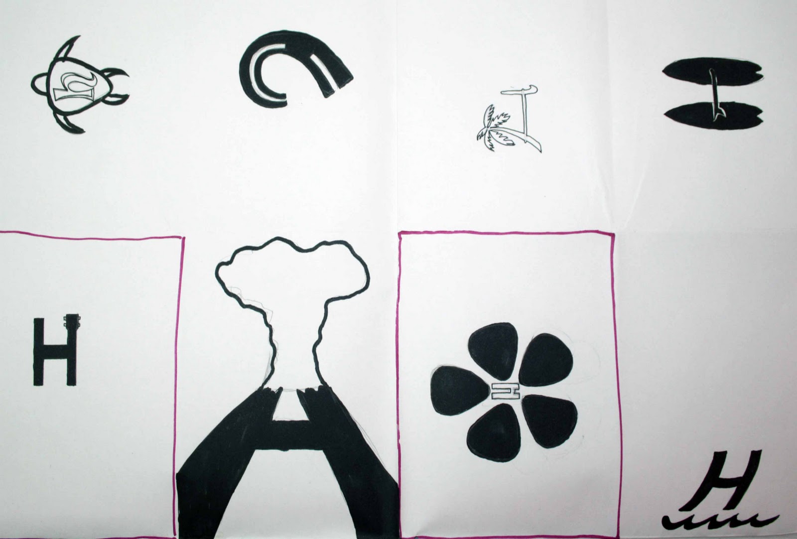
In response to the task Fred set us I only managed to get 96 logos done, which although not the required amount to complete the task i felt it was an achievement on my part as I've never done so many different designs in such a short space of time. I have done that many variations of a handful of designs before but with this I really tried to push myself for differing ideas with each logo.


These are not displayed in chronological order but I definitely noticed that the more i was designing the longer I spent on each logo, the better I got a drawing, my curves were smoother my liners were straighter (didn't use a ruler for a lot just to save time and get my ideas down) and I had begun to make use of the different thickness of pens more and the possibilities of filling certain parts in and reversing out others and so on.

The task was challenging mainly due to the time we had to complete it and this is evident as I only managed 96 however I did get some good drawing skills out of it and it got me back into the designing mindset that got a little left behind at the end of first year and my work placements.

This does now provide a bench mark for me and shows that progression of how to work as a student on this course in second year apposed to how I started off working in the first year.