Monday, 7 March 2011

Visual language - Photography Workshop.

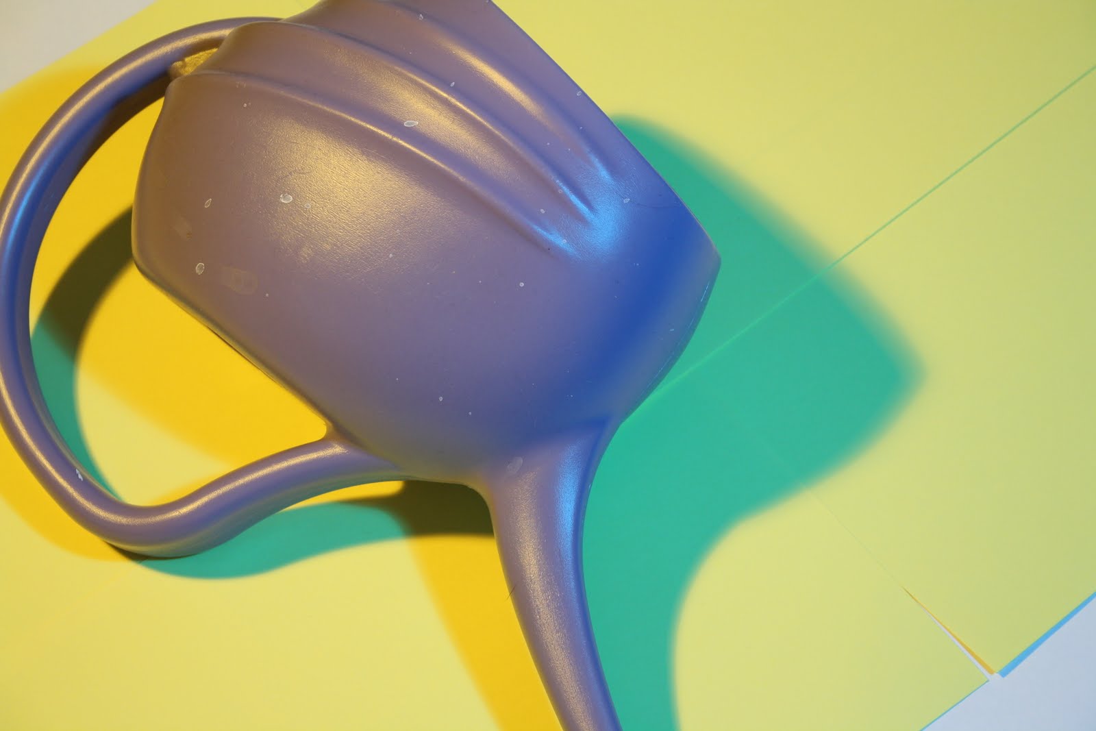
These are the photos i took during the Photography Workshop. I have already done my elective in digital photography so i new a fair bit of the stuff we were taught but nonetheless it was still helpful to have it taught to me again and there were other things i did learn about.
For instance, we were shown all the differences between the settings on the camera and what they are typically used for and how they can effect the lighting, and balance of contrast. What i found most useful was being shown how to set up and utilise the camera equipment like the lights, soft boxes, colour gels etc. 
During the elective we looked mostly at artists and concepts of photography and only touched on the basics of the camera functions.


Friday, 4 March 2011

Letter, Word, Sentence, Paragraph - Final Posters and Thumbnails.

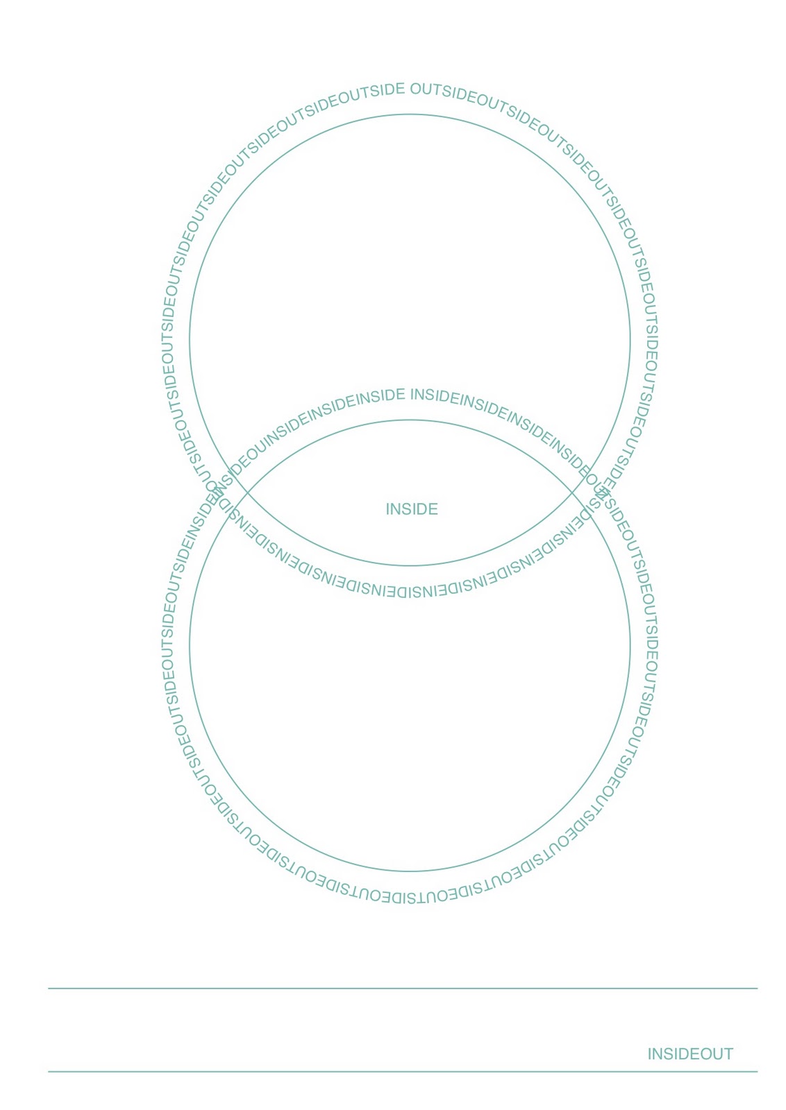
These are the final prints for this brief. In the final critique the group said they liked the stock and choice of colour but i should still experiment with more colours and more than one. The purpose and audience is lacking somewhat as there is no message being put across and  its purely a visual design representing the theme of outside and inside and the word opposite.


These are the rough thumbnails we had to produce alongside the 3 posters. i found that ost of my ideas were to big to manage and complete in the given time and they were also playing to my strengths which are photography, illustration and image. Type and typography are not my forte so i felt it was an opportunity to practice and work on my typographical skills and get more in touch with the illustrator software instead of basing my work all on hand rendered or drawn designs.

Thursday, 3 March 2011

Letter, Word, Sentence, Paragraph - poster designs.

I've gone for a simple design because of the time we had to produce the posters in and as most of my thumbnail ideas were a bit too big to achieve i thought it would be best to getting  on with something that i can finalise. Furthermore i felt that i bit off more than i could chew with the last project so this work shows a better reality of how fast i can work.


I like the design above with the use of negative space but I'm swaying more to the one below for my final deliverable.


Wednesday, 2 March 2011

Visual language - Final books folded.

The final prints all folded and cut, I hope that they sell well but hopefully ill get to keep a print for myself as well.


I've used Antique White as my stock as it gives a warmer feel to the book, the plain white stock i was testing on was a bit cold and didn't add anything extra to the book, also this stock its much nicer to handle and it folds well without blistering at the edges of the folds.


Visual language - Book Prints.

I printed these final designs for my book from home and they came out really nicely, very clear and crisp all that needs doing now is folding and slicing.


Larry the lizard...


I had to do a few test prints first to make sure that everything alined correctly and found that the snake drawing was rather small and dark in comparison to the other two so i had to resize it and in turn that meant i had to reposition the lizard to get a visual consistency as you go through the book when folded.


...and his chums.

Photoshop Software Brief - Postcards printed

These are the final prints for my postcard that i have developed as a result of the software workshops  and in response to the brief.


I've played with the hue and saturation to get the colour to turn violet which was my given colour and using different layers and taking away sections i created the contrast in colours. I think the yellow, being the complimentary opposite of the violet works really effectively.