The articles i was looking at for this workshop were both on the Royal Wedding as it was the hottest topic of the week and thus covered by the majority of the tabloid magazines and newspapers.
NOW magazine was my choice of low end tabloid. The layout is somewhat untidy resembling a floor or table surface scattered with polaroid photos. This is a tool used, I would imagine, to make the article look more dynamic and interesting whilst not being too serious.
Vogue was my high end choice of tabloid. Its layout is very crisp and tidy giving it a sense of sofistication and higher class. There is no abstract composition of the body of text and the images they simple do the job.
Both articles are about the Royal Wedding but there is a major difference in the content. NOW magazine's content is focussed on the actual event of the wedding day and the ceremony, highlighting who was who and wearing what on the day. Whereas, Vogue is focussed on Kate Middleton's fashion sense and style of clothing and doesn't touch on the clothes being worn on the wedding day. This could be due to the article coming out prior to the wedding and NOW being released shortly after it.
GRIDS.
First attempt. Type and Grid is definitely not my forte, however I do find it interesting and useful. I was missing crucial parts to my grid as i had never made one from scratch before, but talking to Lorenzo helped as he pointed out flaws in my logic and got me to think about it differently and loot publication layouts in a different way.
Second attempt. Revised my grid and gave it more columns and a smaller boarder, also gave it narrower gutters to be more realistic.
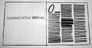
Third attempt. This is my refined grid which after a good hour of learning how to make a terrible one and then correct it was ready to use for the layouts below. These layouts aren't finished however i still need to put more information into the images to show the cropping and other ideas i had whilst constructing them.
Lorenzo suggested using thicker pens for heavier point sizes and thinner for lighter ones. I think that my designs aren't as creative as they could be but this just goes to show my weakness in this subject. It's definitely something i need to develop further.
I need to add the wacky versions of the layouts to the post as well but they aren't to hand at the moment.


No comments:
Post a Comment